This weekend, attending Data Saturday Denmark, I joined a session presented by Benni de Jagere. Benni works for Microsoft as a member of the CAT team but is also very active in the community as an organiser and speaker.
In general, when Benni starts speaking and sharing knowledge, it’s well worth it to listen and learn.
Metrics app time point detail
In a number of previous blogs and in my session on loadtesting Microsoft Fabric, I’ve always questioned the metrics app and one specific point is the timepoint detail. When you click on a graph, you get the option to go to the timepoint detail and read more.
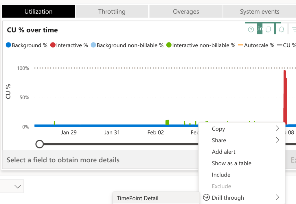
This is all fun and games but looking at the list of active processes at that specific point in time, you’ll quickly see processes that are way out of the selected point in time. For me, it rendered this thing useless because it messed up the things I wanted to see.
As you can see in the screenshot, the start time is before the filter shown at the top left.
Adding information
In comes Benni who also goes into this details view and I need to restrain myself from asking about the messy extra data. That is, until he acknowledges this. And fixes it!
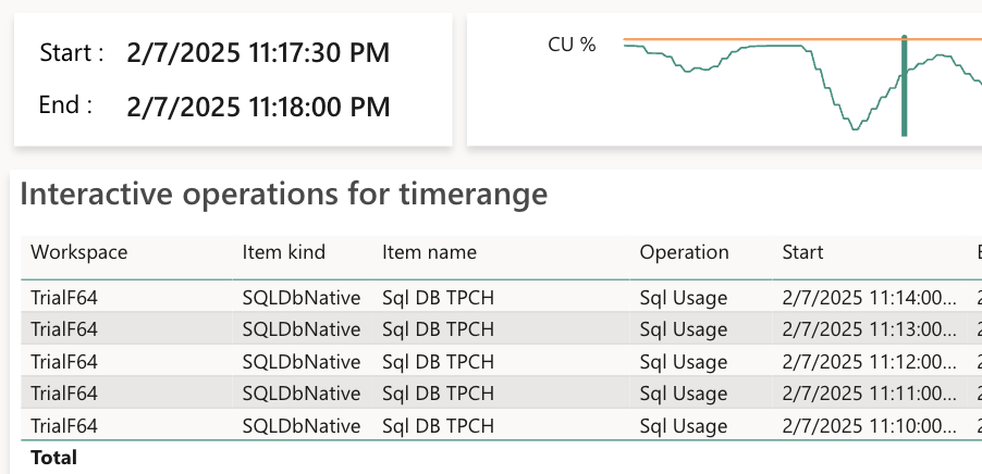
Because what we’re looking at is not just what was actively running at the time, we’re also looking at activities that are smoothed out from earlier and still adding to the load at that point in time.
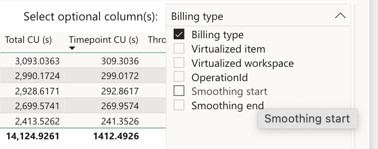
So by checking the boxes Smoothing start and Smoothing end, you can see why these rows turn up in the selection you made.

So now you can see that the smoothing operations are within the timepoint window and have a right to be there. And it provides some insight in the duration of the smoothing process.
It makes more sense now
But, this doesn’t solve a lot of other issues I have with the metrics app. One being that when I zoom in on a graph, it starts to break up; it looks like not all the data is collected and saved.
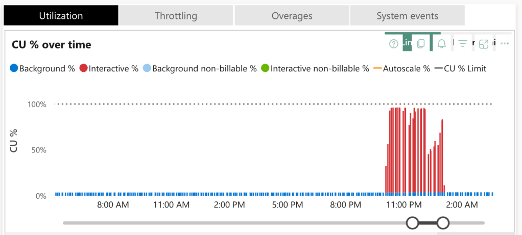
Filter, don’t zoom
Again, the issue is addressed. And this comes from my total lack of knowledge of Power BI. Apparently, there is a maximum of data points a graph can handle. And when you use the slider, you zoom in, you’re not filtering data. Power BI apparently chooses almost randomly what data to show and what to discard in the graphs.
The fix is to filter data on a certain data or range in time. At that point, the data will be refreshed and your graphs will fill up (more).

When you create your filter, close the pane and wait for the graphs to refresh.
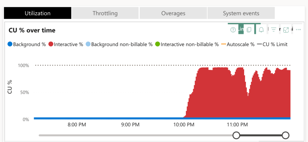
Now you can see the graph is nicely filled and will show so much more information! And it actually usable as well.
Finally
Now, this part above is from memory; any mistakes here are mine and mine alone. I’m no expert on Power BI and will never pretend to be. My main point is to help a lot of you out who are struggling with this app. I hope this clarifies some things.

2 thoughts on “Mastering your Fabric Capacity Metrics App”