In my previous blog on Fabric and loadtesting, I ended with not really knowing how PowerBI would respond to all these rows. After creating and presenting a session on this subject, it’s time to dig into this part of Fabric as well. There were questions and I made promises. So here goes! This blog will only show the F2 experience as that’s where things went off the road. And, as I’ve shown in the previous blog, the CU count doesn’t change between SKU’s, only the amount of SKU’s available changes.
This blog isn’t meant to scold Fabric or make it look silly, I’m the one who’s silly. The goal is to show some limitations, a way you can do some load testing and help you find your way in the available metrics.
Disclaimer: I’m anything but an expert on PowerBI. My designing skills are laughable and therefore not the point of this blog. There are many people better qualified than me on report design. Just like the previous blog, this isn’t about optimal design or performance tuning. The only focus of this blog is to hammer PowerBI with a lot of data and see how it fares.
Semantic model
Now, before you go off and create your report, what you need to do is create a semantic model. This is like the Entity Relational Diagram or (SAP) Business Objects Universe of your tables. Not all the tables, just the ones you need for the report or domain or use case. To keep it understandable, I’ve created a small model for my report.
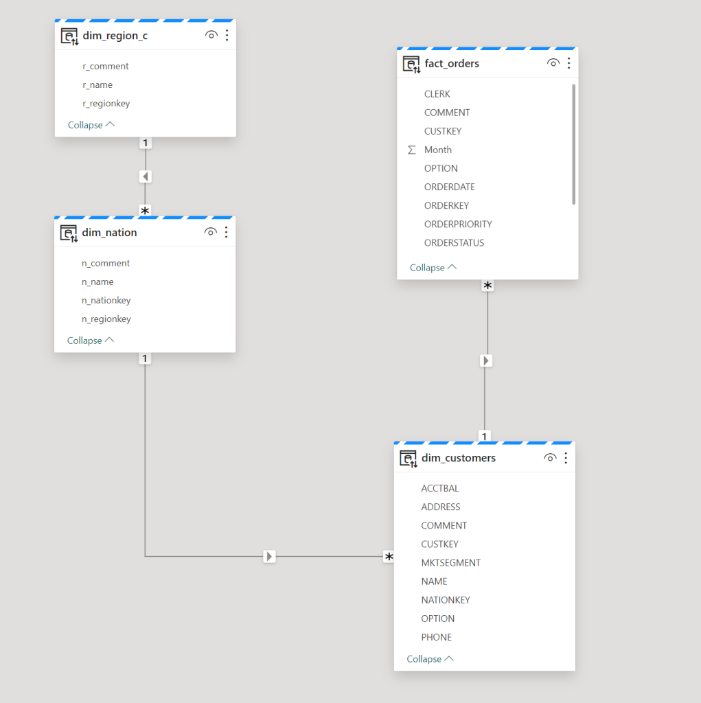
Even though the names suggest otherwise, it’s just a normal model. Anything but a star schema. In a future blog, I’ll create a nice, denormalised model with a fact, proper dimensions and a star schema. Again, the goal is to just hammer PowerBI with a lot of data.
The customers table has about 150.000.000 rows, the nation table about 50 rows and region has 5 rows. The Orders table has 750.000.000 rows. Not the largest set of data I can slam to PowerBI but let’s take it easy to begin with. We’ll always have the orderlines table if needs must. Before I create some stuff in PowerBI, let’s look at some limitations.
As shown in the previous blog, depending on your Fabric Capacity, you get anything from half a core at F2 to 256 cores at F2048. This will have impact on your report performance and some other variables within Fabric. Check the limitations documentation for the current limitations. As far as I could find, there are no row restrictions on the report itself, there are some on exporting data to Excel or CSV. Which you shouldn’t need as you’ve got PowerBI. Right?
There’s a limit to the maximum size of your semantic model. This one puzzled me a bit, because the semantic model as such is small. It’s just a set of meta data about the tables, columns and relations between them. What Microsoft means is the data volume of the tables; the amount of GB in your Lakehouse or Warehouse.
So, let’s move from this model to the PowerBI pane and add some data.
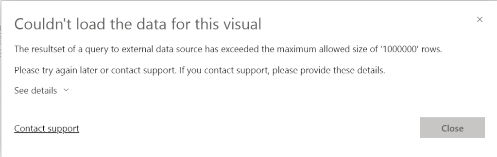
Error
After creating the semantic model, I created a new report. Dragged a visual on it and populated it with a column. After about 10 minutes, this happened:
Edit 12th of march 2024. Nikola Ilic (B | L) came up with the following:
In fact, guardrails in Direct Lake mode include row-per-table limit (300 million for all sub-F64 SKUs), so this is what happened to you in the first case. The 1.000.000 record exceeded is a well-known “feature” of DirectQuery, so I assume the following happened related to error you were getting: your table has >300m records, so it fell back to Direct Query, and then the query for the specific visual returned more than 1m rows, which is throwing an error (this is DQ limitation, not Direct Lake).
Nikola Ilic
Truth be told, this error was hard to reproduce as later errors were different. But I still wanted to show you this one as it provides a valuable insight into limitations that are less easily found.
It seems I’m not allowed to load over 1.000.000 rows into my report from an external resource, even though my resource is a Lakehouse. Well, I was only trying to load 750.000.000 rows into this one so fair enough. Moreover, what I wanted to do was show a row count, but that clearly failed :D. Funny thing is, with DirectLake mode, you can’t add columns to the dataset or change the datatype. I found this one out whilst trying to convert a string datatype to an integer to be able to use an aggregation on the report. If you weren’t aware already, note that datatypes matter, even more in your lakehouse. Well, moving on.
I created some slicers for Region, Nation, Year, Quarter and Month. Because from my point of view, end users are most likely to be interested in a subset of the data (i.e. for their country, region or whatever).
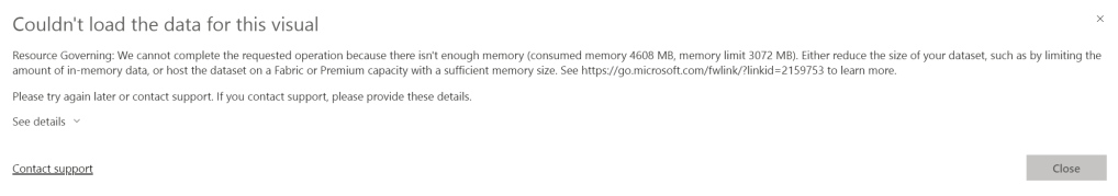
As I tried to take a screenshot, this came up:
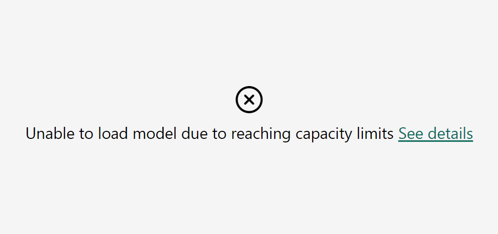
Why?
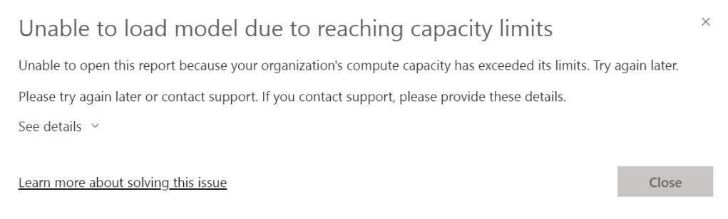
Well, that’s not really helping if the detail states the same as the main error.
It seems my F2 capacity has blown up. So let’s leave the report and dive into the capacity app! I’m very interested into what kind of information is available in there.
Capacity app
I’m assuming you have some familiarity with the capacity app, if only the location of the different graphs. Loading the app showed me this graph on the right hand side.
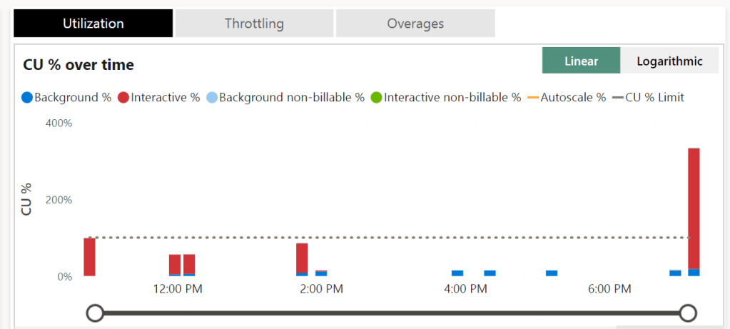
I have gone WAY over the CU limit for this one. Getting close to the 400% mark. When you look at the docs, bursting allows you to, temporarily, use thrice the amount of CU’s you’ve provisioned with the F SKU. One could argue I even went over that part. Let’s see what the other graphs show.
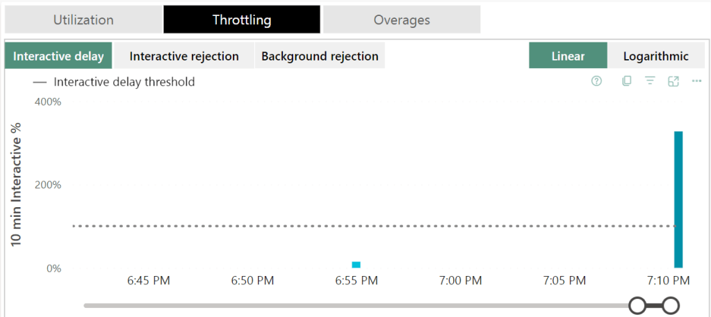
Of course there was interactive delay, this is the first thing Fabric goes to when you start to hammer it above its pay grade. It will gently ask you to take it easy.
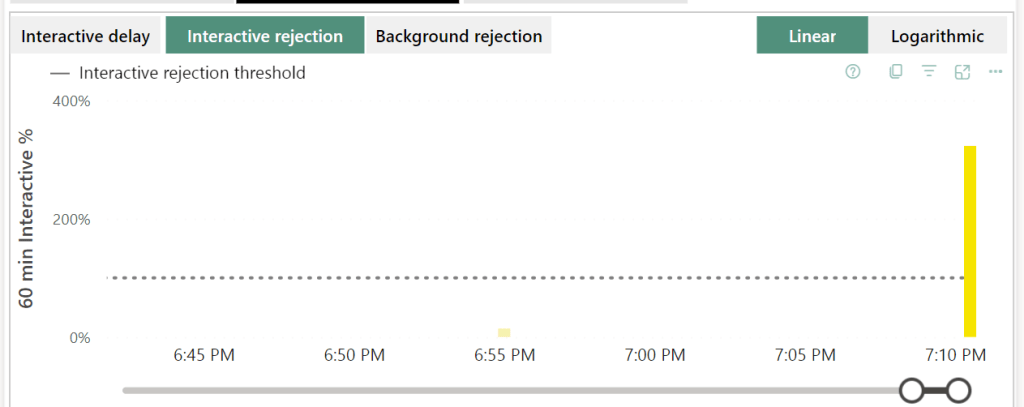
Next, it will be less gentle and start rejecting you. This will show you messages like the one above, cannot load model due to capacity limits.
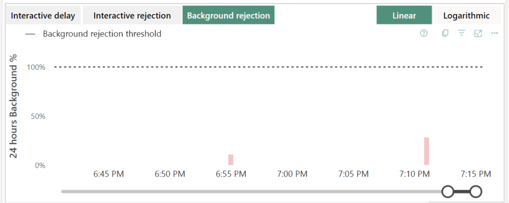
Not much background rejection. Why? Well, the report is interactive. That’s where the pain lies. So it’s not too weird that this one is within bounds. If I were to run a pipeline or notebook, those are background processes and these would show up quite quickly I think. Not tested for this blog though.
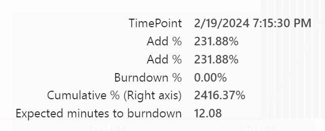
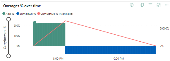
Let’s look at the Overage pane of the report. And then we see some interesting stuff!
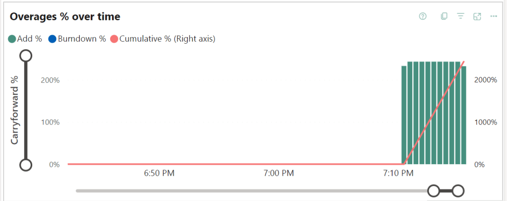
When I hovered over one of these green bars, this is what came up:
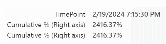
The red line showed this:
Well, what did my report do?
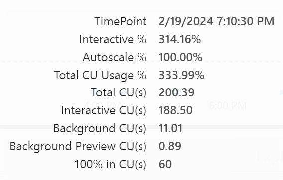
I have 60 CU(s) at my disposal and for the report needed 188 CU(s). Or a little over three times what I have at my current disposal. PowerBI tried as hard as it could, now showing stale information until you try to refresh it. Then the message appears telling you the capacity is blocking everything. I imagine it laying flat on its face hoping this too shall pass.
Return to normal
Now the question is, how long does it take for Fabric to resume its normal duties. That where I saw something funny happening.
At 19:25, there were about 32 minutes to burn down the extra used capacities, at 19:45, there were 76 minutes to go. But, that’s adding up, not counting down. That seems because the green bars will still coming in; a sort of smoothing of my bursting process.
In this case, the burst went from 19:10 until 20:14. The burn down from 20:14 until 23:16. Again, you can see that there’s a number of three at play. I can triple my capacity temporarily, but the burn down (or repayment of my overused capacity) won’t go at that rate. Which is as expected.
Retry
So, after letting this capacity getting back to life, the second check I wanted to is to see what happens when I overload my F2 again and upgrade to F8. What will happen?
My report had gotten lost so I had to recreate that one. And when creating it, I got a different error:
Not only does the F2 have a limit of 1.000.000 rows, it also has a memory limit. Which is a nice find. So 3 gigabytes of memory for the F2.
Though not as heavy as last time, I did get my overages again:
Taking this as a starting point, time to go from F2 to F8 and see what happens.
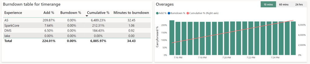
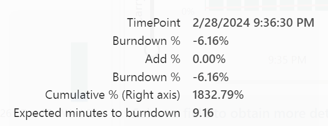
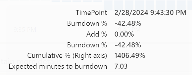
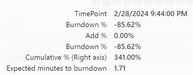
The Burndown rate with F2:
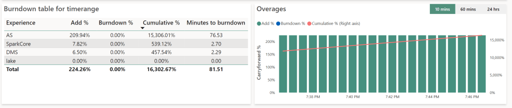
After switching to F8:
So if you’re in a hurry to get back to normal, you could invest a little money to burn down the overages faster. In this case the difference is almost trivial but I can imagine scenarios where burning down the overages can make a serious difference.
Final test, shutdown the capacity when overloaded
This is something I wanted to try out, but didn’t have to when I found a blog by Microsoft. It quite simply states that when you’ve overused the capacity and then pause it, the overusage that would have burned down will now be added to your Azure bill. This means that you will still pay for the compute used. The next time you start your capacity, it doesn’t try and burn off the extra usage that might still exist. Fair enough I think.
Finally
What I learned from this tests is not only that PowerBI has limitations and your overage use can bite you much harder than expected, it also shows that the humans designing your data model need to be in close contact with those creating reports. Design mistakes on either end will have serious consequences. To drive that point home, it’s not about front-end or back-end leading the way and deciding the direction or model, it’s about cooperation between them. It’s about working together.
Cliffhanger
Whilst testing out PowerBI, I did test some stuff with Dataflows Gen2 as well.

One thought on “Loadtesting Fabric part 2, bringing Pain to Powerbi”