

In case you missed it, Microsoft released a new version of the Metrics App. We all know the current one, and we have opinions on it. But it’s all we’ve got from Microsoft, so we made do.
But now, there’s a new one. Or, well, a new one. When you install a new version, you get a second option!
Preview added
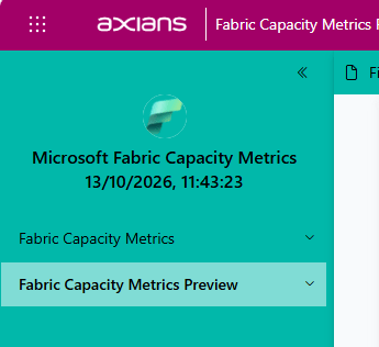
When you install the new version, you can see the regular one we’ve all gotten used to, and the Preview one. That’s the one you want to look at.
Health
The health bar looks way better than before
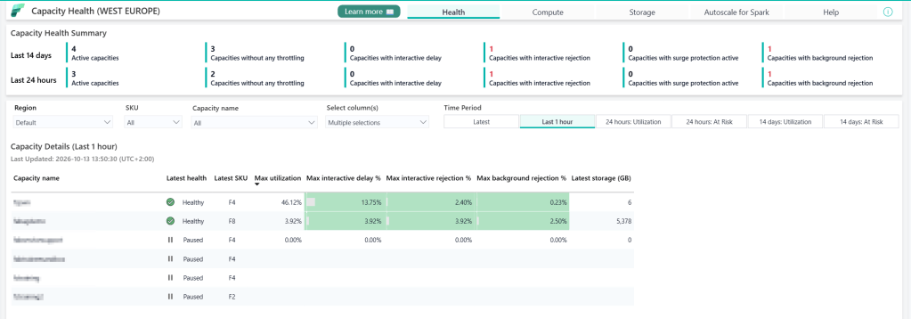
This is a lovely overview, colour-coded as well. It helps seeing where an issue may lie
Compute
The Compute screen has also been changed. The main graph you see is coloured too, but only when things get yellow or orange is trouble on the horizon.
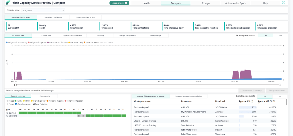
You can also see the heatmap in the bottom-left corner, which shows when capacity is active (this one does get paused) and the state per hour. This helps you identify when loads are high and where you can adjust your scaling strategy.
Storage
The storage overview has been improved too
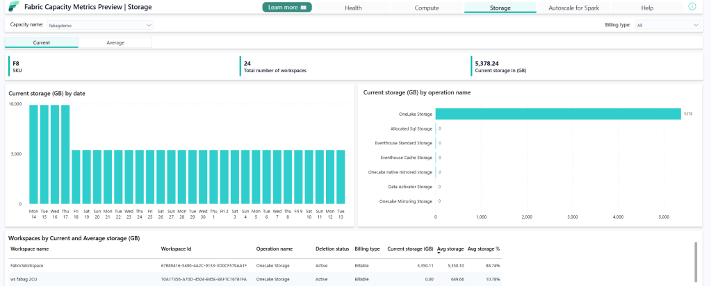
Very easy to identify the workspace with the most storage. TPC-H testing is fun, y’all!
Timepoint detail
Yes, you can still dig into the timepoint details.
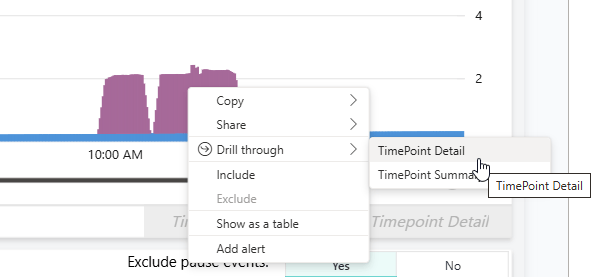
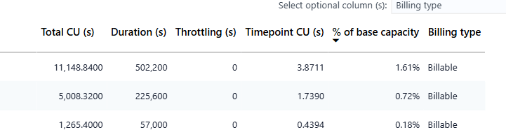
This will not only show you what was running at that point in time, but also the amount of CU(s) of your base capacity was used.
Install, now
Yes, go now. Move to Fabric, select the Power BI interface button selection thingy in the bottom-left corner, go to Apps, and get the latest version. It’s in preview, which means Microsoft really likes to hear what you think!

